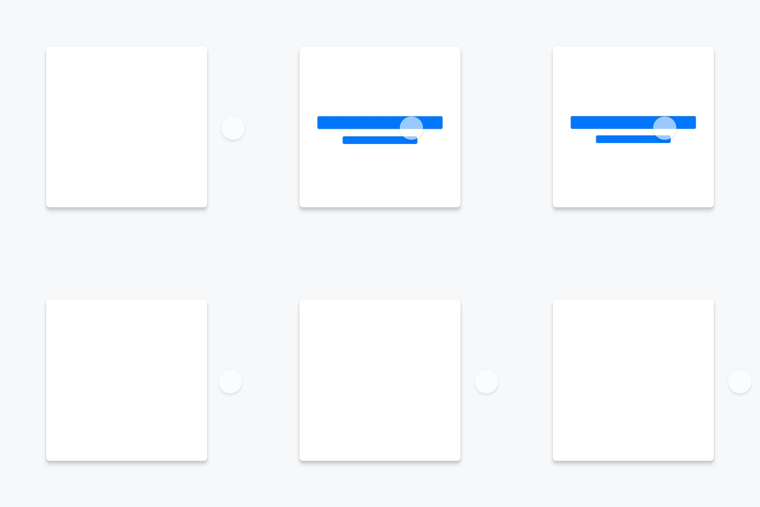
Core Components
AbsoluteBackgroundImageBadgeBannerBlockLinkBoxButtonCardCheckboxCloseButtonContainerDividerFlagFlexFormFieldGenericBannerHeadingHideHugIconIconButtonIconFieldImageInputInputGroupLabelLinkPlaceholderImageProgressBarRadioRatingBadgeRelativeSelectStampSwatchTextTextAreaToggleBadgeTooltipTruncatePopover
PopoverMotion
Benefits
Feedback
Response to a user action
Providing feedback helps reinforce user actions: someone does something, something happens. Things like hover states, click states, dropdowns, etc. can all give the user helpful context relating to how or why an element responded to a tap or click.

Emphasis
Attention focus without action
We know what we want our users to see, and can use motion to draw their eye to it. Calling out key elements can help convey important information or highlight a specific instance that is noteworthy on the page.

Context
Giving the user hints
The user isn’t as familiar with our path as we are. We can use motion to explain why things are acting the way they are, and give hints as to what will happen next. This is useful for transition states: showing a standard loading indicator, or staggering content load to properly convey information hierarchy.

Delight
Make the experience feel unique
Let’s have some fun with it! There are a million opportunities to add enjoyable instances of animation to enhance the user experience and bring a little life to the site.

Standards
To behave in that uniquely Priceline-y way, we need to adhere to a set of standards upon which we shall build our formula for animation.
Short & Sweet
Animations should be executed quickly, but deliver their important benefit in a short period of time.
Decisive & with Purpose
Animation should not exist just for the sake of animation. They should provide the user with feedback, emphasis, context, or delight.
Friendly & Welcoming
Gentle easing should allow the user to have the perception of a comfortable environment, without harsh transitions between states.
Subtle but Powerful
Animation should not be the center of attention. The user should be able to navigate as usual without distraction, but have the added benefit.
Foundations
These are the 4 main building blocks we can build our motion standards off of. Defining and combining motion styles, transition durations, easing curves, and delays will allow our products to move much more fluidly.
Style
Defining standard types of motion
- Example:
scaleIn
Timing
Defining standard transition durations
- Example:
durationFast
Easing
Defining standard spacing values
- Example:
easeInOut
Delay
Defining standard transition delay
- Example:
delayMedium
Movement
Defining standard movement distances
- Example:
moveLarge
Style
These are the fundamental elements of motion that we can employ throughout the system. They are the first building blocks to deliver the user the feedback, emphasis, context and delight that they deserve.
Move
Position change

Scale
Scale change

Fade
Opacity change

Spin
Rotation

Color
Color change

Float
Z-space change

Morph
Scale & Position

Slide
Position & Opacity

Grow
Scale & Opacity

Timing
For any given distance an object must move, the time it takes to achieve the transition determines how fast its movement is. Bucketing these durations allows us to assign them to components, creating a timing standard.
durationFast 150ms
Used in small animations like button presses

durationNormal 300ms
Used in medium animations like popovers and tooltips

durationSlow 450ms
Used for larger components like modals

durationSlowest 600ms
Used in the largest animations like page transitions

Easing
As an object moves a given distance at a given time, its displacement is influenced by the spacing influence between its origin and destination. By creating easing buckets, we can standardize the physics of our motion and define its use relative to the context of the movement.
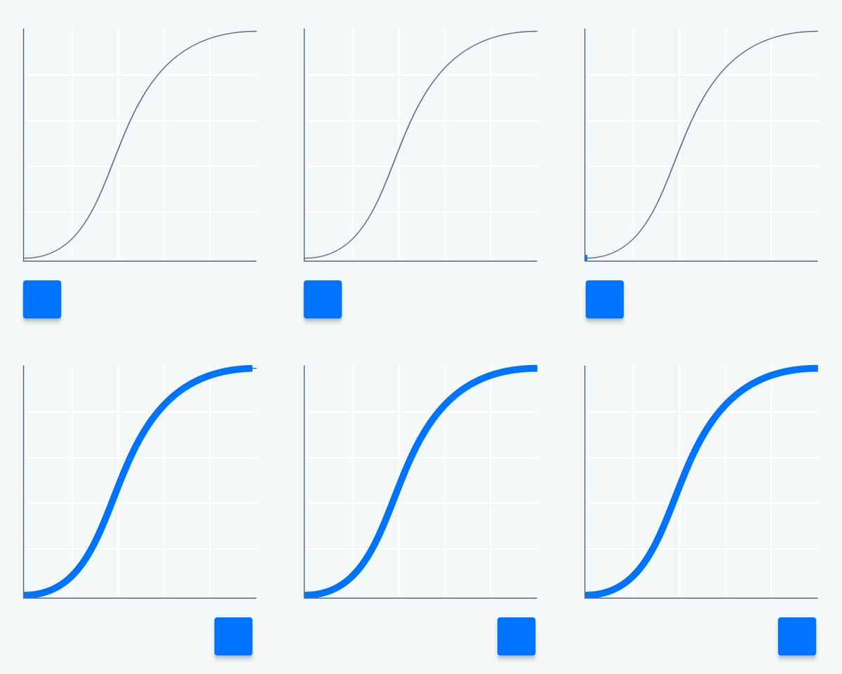
easeInOut 0.50, 0.00, 0.25, 1.00
The primary easing curve. Used for any core animation not entering/exiting the screen or a component
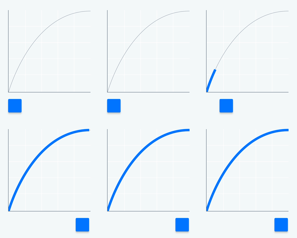
easeOut 0.00, 0.00, 0.25, 1.00
EaseOut is used when an element is appearing on-screen or within a component
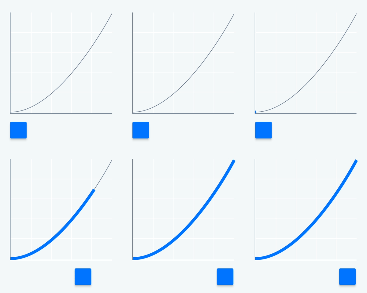
easeIn 0.50, 0.00, 1.00, 1.00
EaseIn is used when an element is removed from the screen or within a component
Delay
delaySmall 60ms
Used in animations within components

delayMedium 100ms
Used in animations of smaller components

delayLarge 140ms
Used in animations of larger components

delayXLarge 180ms
Used in animations involving multiple components

Movement
For elements that are changing position, we have defined some set distances they can travel.
moveSmall 8px
Used in animations involving parts of a component

moveMedium 16px
Used in animations of smaller components

moveLarge 24px
Used in animations of larger components

moveXLarge 32px
Used in animations involving the largest components

Patterns
These patterns help paint the picture of our product to the user. Proper execution and repetition of these elements will create a uniquely branded behavior for Priceline.
Determinate Load
The determinate loader is used in instances when load time can be determined.

Indeterminate Load
The indeterminate loader is used in instances when load times cannot be determined.

Skeleton Load
Skeleton loading is used in instances where dynamic content is loading.

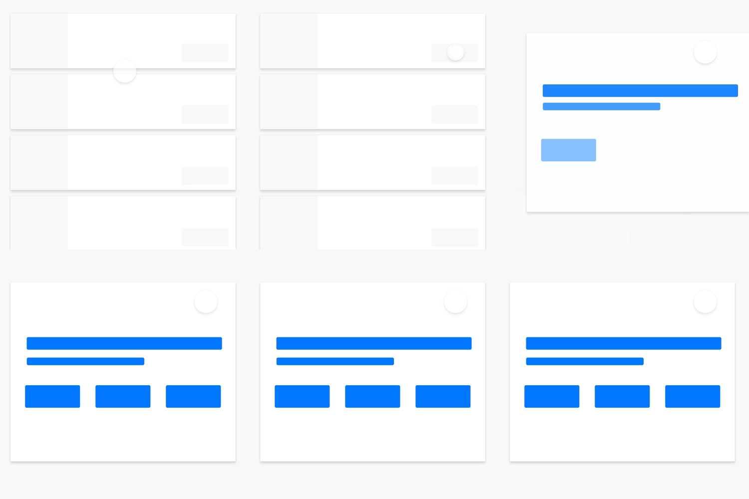
Staggering
Staggering content as it loads in helps establish an information hierarchy to an unfamiliar user
Directionality
Objects should enter the screen from a logical origin and exit accordingly.

Parenting
Parenting helps the user develop relationships and hierarchy between two or more objects on-screen.
